Goals &
Objectives

The Challenge

While focusing on numbers the earlier version of this FinTech platform neglected user’s online interface experience. The earlier platform was very dull and tough to understand.

The Solution

We set our goal to deliver an intuitive, smooth, and aesthetically pleasing UX through revamping the user flow, information hierarchy, and style guide for the user interface.

Strategy

Research

In this phase, we used a combination of qualitative and quantitative research methods to identify the following:

  • Interviewed some of their current partners and understood their current pain points

  • Key users and their demographic criteria

  • The needs that their product meets for their users

  • Their existing product UI/UX audit

  • The user experience offered currently by their competitor

Design

In this phase, we created a UX strategy and various prototypes to be tested and deployed, including:

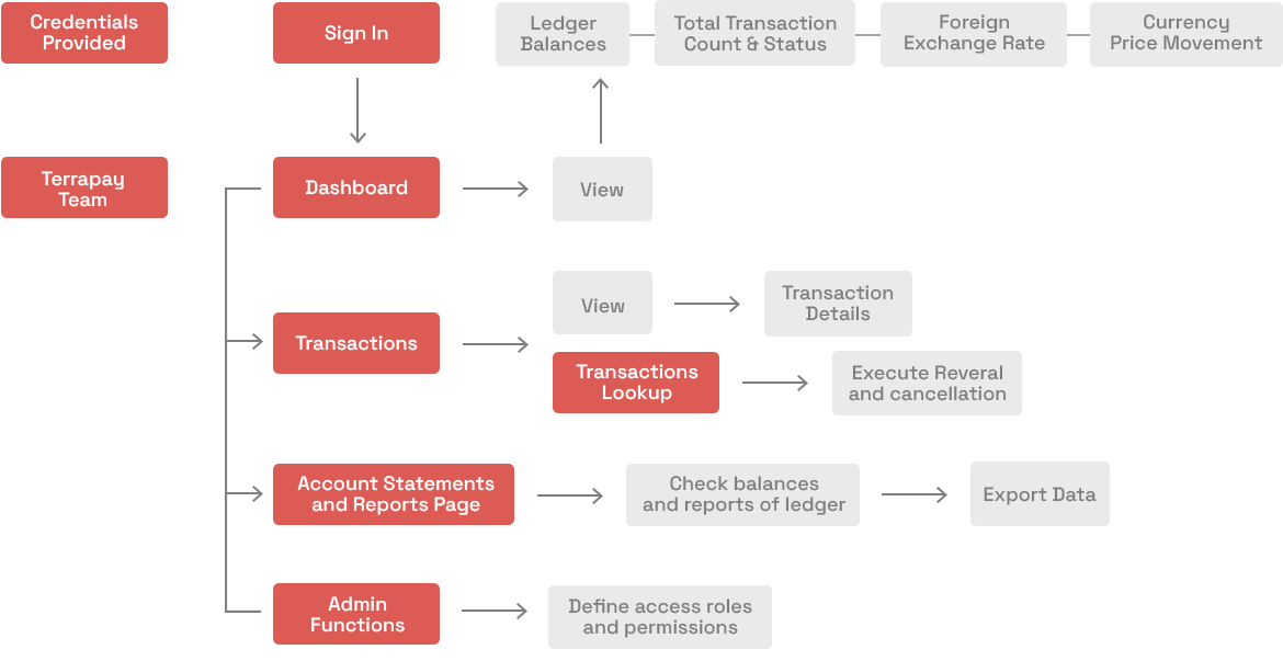
  • Documented UX strategy and user flows

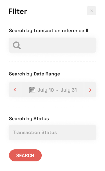
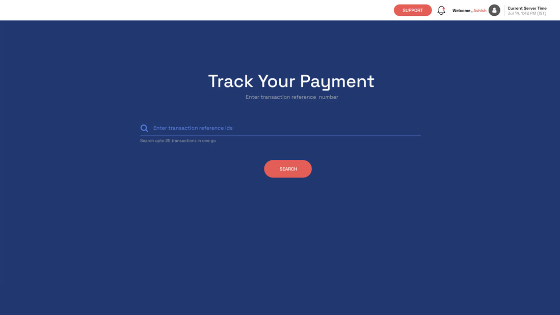
  • Designed wireframes for review and approval

  • Designed prototype for all the necessary screens

  • User interface, elements, typographic style, color, icons etc were finally designed.

Develop and Test

In this phase, we started the frontend development and created functional prototypes and sent it to their team for testing. By measuring interaction with these prototypes against predefined standards, we were able to make a series of iterations to the UX strategy and product design.

At the conclusion of this iterative process, we were able to deliver a final frontend product for the backend development team to integrate with the necessary api’s and further development.

UX Audit

Here’s an overview of a UX audit that we conducted on the Engage platform and a few solutions that we have conjured up over the weeks.

What does Engage's existing platform look like?

Currently the Engage platform loses the attention of their users, due to following factors:

  • Notification Panel is important for pushing important information, it’s currently missing

  • Currently it is not clear in the platform according to which timezone any time based filtering is made. As in when we say Transactions Count for “Today” then is it according to the website visitor timezone or Server timezone.

  • The structuring of important sections in the platform like issues of spike in failing of transfer, across any country corridor is very tough to understand and navigate

  • No Insight or Personalisation in the platform

  • In Dashboard it would have been better if the user can easily view which country corridor are having good or bad transaction delivery time

  • The Transaction Count is not very clear whether it represents the count of transactions for the whole account or any particular country corridor.

  • Currently a user has to scroll a long table to find exchange rate to any desired currency.

  • Easy way to contact support and raise ticket from platform should be available, currently missing.

  • Styling of each section is very inconsistent, there is no clear headers or line spacing, column spacing across the entire platform.

  • No Use of color to represent positive or negative transactions

  • Use of space not optimal

  • In Current Ledger Positions, can't understand as a layman user what do the columns represent

  • It might be important for an account holder to know a recent debit/credit in any particular ledger which is not shown right now

  • If you reverse engineer the Count shown in Transaction count with the Dashboard Monitoring page you won't be able to match the values, which becomes very confusing for the website visitor.

  • A separate section is dedicated for showing the chart of any foreign exchange rate history. There can be a better way to represent foreign exchange rate and its history.

ux-audit-img

Dashboard

A separate section is dedicated for showing the chart of any foreign exchange rate history. There can be a better way to represent foreign exchange rate and its history.

Transaction Monitoring

The Transaction Monitoring is an important part of the platform which indicates spike in failed transactions so somehow this should be easily represented in dashboard

ux-audit-img
ux-audit-img

Transaction Delivery

In Transaction Delivery page the time frames are too many, there should be some important ones only. The graph is too tough to understand when there are too many country corridors and too many time frames.

Transaction Lookup

In Transaction Lookup currently the transactions on any day are a lot and looking at the column for date and time it seems the date and time should have been separated

Currently there are too many columns in each row and that can be reduced

There are some important buttons like reverse transaction, cancel transaction which is not clear though

Important information like status, total transactions are not clear

ux-audit-img
ux-audit-img

Transaction Delivery

The detail of transaction looks very unpleasant because there is no structuring of data

Data of transaction detail can be visually more appealing clearly showing a transaction journey

Competitor Analysis

Throughout the past decade, many new financial services have emerged to which we have onboarded. There were a few that left an impression on us due to the positive user experiences they provided.

ux-audit-img

Mint

A budget tracker and planner

What we feel about it:

Insightful Easy to use Beautiful Design

Robinhood

A stocks, ETF’s and crypto currency trading platform

What we feel about it:

Slick Simple Thoughtful Design
Frictionless Fun

User Persona and User Analysis

During the initial KT sessions we identified the main users of the platform are not the end customers who send and receive the money but they are actually the backend support executive of the partner companies.

  • Send Partner like Western Union, Bank of Punjab etc.

  • Receive partner like any partner bank or aggregator

User Journey

user-flow-img

Wireframe

wireframe-img
wireframe-img
wireframe-img
wireframe-img
wireframe-img
wireframe-img
wireframe-img

Typography & Color

Space Grotesk

abcdefghijklmnopqrstuvwxyz

1234567890

60px

40px

30px

25px

18px

16px

Bold

Semi-Bold

Regular

Light

#213770

#2a468b

#5075cf

#e35e57

#ff7976

#ffa09b

Dashboard

ui-design-img

Transaction Lookup

ui-design-img ui-design-img

Transaction Detail

01 ui-design-img
02 ui-design-img
03 ui-design-img
04 ui-design-img

Trackpay

ui-design-img
ui-design-img ui-design-img

Account Statement

ui-design-img ui-design-img

Transaction Delivery Time

ui-design-img

Country Monitoring

ui-design-img